Data visualisation
Data visualisation
Turn data into engaging visuals for high engagement and clearer direction
Turn data into engaging visuals for high engagement and clearer direction
After our data management and data processing and modelling services, we can show you data in more palatable formats. This may be as KPIs for the team updated in real-time to show and motivate sales or key business reports for department heads. When data is in the right format, it is easier for viewers to digest and make decisions.
The growing volume of data and rising number of users means organisations need to turn raw data into actionable insights for decision-making. To meet this demand, data analytics has expanded dramatically. Visualising data enhances accessibility by presenting information graphically. Modern data modelling transforms raw data into useful insights for analysis—cleansing, defining measures and dimensions, establishing hierarchies and formulas, and setting units and currencies. The modelled data then enables dynamic visualisations.
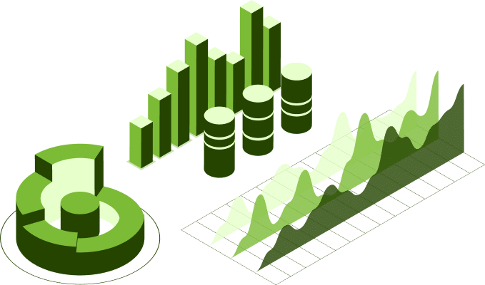
Data visualisation is the practice of using visual elements like charts, graphs, and infographics to make data easier to understand. While data tables are useful, data visualisation helps people see patterns, trends, and relationships in data that may not be obvious from raw numbers alone.
Data visualisation is used for a variety of purposes, including:
Data visualisations come in various types, each with unique advantages and drawbacks. Common types include:
Through data reporting models, we allow you to visualise your data on dashboards and get easily digestible reports for your end users. We can also help with Business Intelligence (BI) and technical visualisation for ML & AI Engineers.