 Contact us

January 5,2024
The Role of Responsive Design
Visiting a website that lacks responsive design is similar to stepping into a physical store with inadequate to no lighting. Despite the store having exactly what you need, the poor lighting makes it impossible to see the products clearly or navigate the aisles effectively. In this frustrating scenario, instead of smoothly walking around the store, you’re forced to stumble, squint, and strain to find what you’re looking for.
Similarly, encountering a non-responsive website on any device is like entering a dimly lit store. Even if the website offers precisely what you’re seeking, the lack of responsiveness makes it a pain to navigate. Instead of a seamless browsing experience, you find yourself constantly zooming in and out, scrolling frantically in all directions, trying to piece together the information you need.
Ensuring that your website is responsive is important for so many reasons, but particularly for Magento websites. It not only improves your overall user experience but also plays a massive role in the ranking of your website, conversion rates and more…
In this article we will take a deeper look into responsive design, with a focus on Magento websites. Covering, what exactly it is, and why it is absolutely crucial for any business with a website to have.
Contents list
- What is responsive design?
- Why is responsive design important
- The challenges of not owning a responsive website
- The benefits of owning a responsive design
- Final thoughts
What is a Responsive Design?
Did you know that 57.2% of all website traffic comes from mobile devices, with only 40% viewing on desktop. Following this, a further 95% of global users access the internet using their phones.
Following on from this, while generally more purchases are made on desktop, 28% of purchases are being made on mobile. And, it is likely that this number will continue to increase going forward with so many people using the internet on their phones; an opportunity you won’t want to miss out on!
Now imagine owning a website that isn’t optimised across different devices.
So what is responsive design exactly?
Responsive design is an approach used in web design and development where websites are built in a way to work across a wide range of devices, from desktops to mobile phones and tablets.
One study defined it as ‘The goal is for a website to retain its optimal usability and appearance regardless of the device it’s displayed on’. The goal of responsive design is to ensure that websites adapt and respond smoothly to the user’s behaviour and environment, this is based on screen size.
As is demonstrated in the image below:
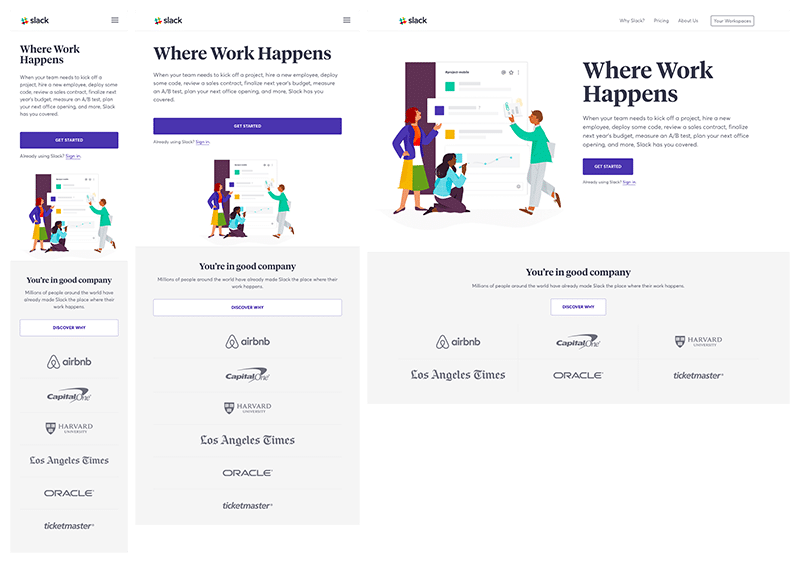
(source)
This is a great example of good responsive design. On a desktop, it boasts a sleek interface with clear navigation. Transitioning to a tablet, the layout seamlessly adjusts, maintaining the easy to follow layout with resized images and now, a condensed menu. On a smartphone, the site transforms again, promoting great usability, it is easy to scroll through and there are no issues with having to scroll left or right to read text or view images…
Regardless of the device, responsive design will help to reinforce an engaging user experience.
By implementing responsive design principles, the content and layout of a site should adjust, remaining as easily accessible and user-friendly on various devices as it is on a desktop. This will improve usability and enhance the overall user experience of using your website.
The thing to keep in mind is that responsive design offers a multitude of benefits, which, as mentioned previously (assuming it’s done right), will positively impact areas such as user experience, accessibility, and search engine optimization (SEO).
For example, if your website is responsive it will be easy to navigate and consistent with other screen sizes, ultimately leading to higher engagement, increased time spent on site, and improved satisfaction!
So now that you understand what responsive design is, let’s take a look at why it’s so important for agento websites specifically.
Responsive design is absolutely crucial for Magento websites just as it is for any other site on other platforms. And yet, many websites are not designed or optimised across different screen sizes.
Particularly in the realm of ecommerce, where users are increasingly reliant on mobile devices for online shopping. Failing to adopt responsive design in a Magento website can lead to significant challenges for clients that will hamper user experience and overall, your business success.
Why is responsive design important?
Responsive design is absolutely crucial for Magento websites just as it is for any other site on other platforms. And yet, many websites are not designed or optimised across different screen sizes.
Particularly in the realm of ecommerce, where users are increasingly reliant on mobile devices for online shopping. Failing to adopt responsive design in a Magento website can lead to significant challenges for clients that will hamper user experience and overall, your business success.
The challenges of bad responsive design.
Mobile Dominance:
The rise in mobile users accessing ecommerce websites necessitates responsive design. Without it, Magento websites appear distorted, cramped, or difficult to navigate on smaller screens, alienating a substantial portion of potential customers.
User engagement:
Non-responsive Magento websites will struggle with poor user engagement due to frustrating experiences on mobile devices. Users encounter issues including tiny text, unclickable buttons, and a cluttered layout. This can negatively impact a businesses conversion rates.
SEO Impact:
Search engines prioritise mobile-friendly websites. Magento sites lacking responsiveness suffer in search engine rankings, affecting visibility and traffic, as search engines favour websites that offer a more seamless experience across different devices.
Brand Perception:
User perception of a brand can be heavily influenced by a website experience. A non-responsive Magento site can convey an impression of outdatedness or unprofessionalism, impacting your brand, trust and credibility. This is why it is absolutely crucial to have a responsive website.
In a competitive online landscape, responsive design isn’t just an advantage; it’s a necessity for Magento websites. It significantly impacts user satisfaction, brand perception, and ultimately, the success and profitability of an online store…
The Benefits of responsive design
Enhanced User Experience:
Responsive design ensures that Magento websites adapt seamlessly to various screen sizes and devices, providing a consistent and user-friendly experience. Users can effortlessly navigate, view content, and interact with the site, regardless of the device they use.
Remember, first impressions are everything, a statement that is just as true online as it is offline. Infact, with the amount of competition and saturation of markets online, it could be argued that it’s more important online. In this instance, the first impressions that people take away from your website need to be positive. But if your website isn’t responsive this is unlikely to be the case.
And with so many other businesses online, as a customer why would you waste your time on a site that doesn’t work efficiently?
With a responsive website your users are more likely to come away from their visit feeling satisfied. One study notes that a good user experience ‘should help businesses achieve more conversions’. With this in mind, note that it could also result in some of your clients returning to your website later on.
Improved conversion rates
Responsive design positively impacts conversion rates. This is because a responsive design will provide a streamlined and user-friendly experience across desktops, tablets, and mobile devices. When you take into consideration that without a responsive design, the only positive experience would be on the screen it was optimised for, it’s not a surprise that efficient design on a range of devices is crucial.
As without it, you will be missing out on a range of potential clients.
One study found that 67% of people are more likely to make a purchase if the website is mobile friendly. This means that when users can easily navigate and make purchases, it will lead to higher conversion rates. The easier it is to interact with a site and take action, the more likely your clients will be to take it.
Increased Brand Credibility
Responsive design contributes to a positive brand image by showcasing consistency and professionalism across all devices. When users have a seamless experience, it builds trust and credibility in the brand, enhancing customer perception.
When users interact with a Magento website that seamlessly adapts to their chosen device, it will foster trust and credibility in your brand. Here’s some ways how:
- A responsive Magento website presents a consistent brand identity regardless of the device used. Consistent branding elements, such as logos, colour, typography, and messaging, are maintained across various screen sizes, reinforcing brand recognition and identity.
- A well-executed responsive design reflects the brand’s commitment to providing a high-quality user experience. This conveys professionalism enhancing the brand’s reputation.
- If a user has a smooth and enjoyable experience on a responsive Magento website, they may feel like they are more likely to have positive interactions with the brand itself. They will associate the experience they have on your website with your business.
Search engine optimisation benefits
Search engines prioritise mobile-friendly websites in their algorithms. Implementing responsive design in Magento sites can lead to better SERP rankings, increased visibility, and improved organic traffic.
In fact, something to keep in mind is that Search engines, particularly Google, have transitioned to mobile-first indexing, where the mobile version of a website is primarily used for indexing and ranking in search results.
For example, it was announced that ‘New sites, however, will be indexed for mobile search by default.’ Meaning that if your website is not optimised across different devices, specifically on mobile, your google ranking will suffer.
So with all of this in mind, how do you go about making a responsive website on Magento?
On a lot of platforms there will be systems and themes in place that will automatically optimise your website across different screens.
However, if you are designing a website on Magento, it is important to have a deep understanding of the specific system as well as different programming languages. Magento is a powerful platform to get a website built on, but its complexity and technical demands can pose significant challenges for inexperienced users.
Naturally, if you are new to Magento, mistakes are going to be made. This is why we recommend you hire a skilled developer who can tailor the responsive design to align precisely with your business requirements. They can then modify existing themes or create custom designs tailored specifically for your business and website design.
Final thoughts
Responsive websites stand as the cornerstone of a good user experience. Understanding why it’s so important is an absolute necessity so that you can efficiently implement these understandings to your own website. There are so many different types of screen sizes now: desktop, tablets, mobiles…
Owning a website that is both functional and easy to use on all of these screens will benefit your business massively. Simply put, sometimes having a website isn’t enough. There are a lot of considerations such as responsive design that need to be implemented for it to be ‘successful’.
From enhancing user experience to positively influencing your rankings on search engines, responsive sites can not be overlooked. Embracing these understandings will ensure that your website resonates with your users, in order to encourage conversions, get found online and foster stronger connections with your audience.
