October 7,2021
What Makes a Good Mobile Website?

Having a mobile website is now more essential than ever
In today’s market, it is now more important than ever to make your website mobile friendly. If you are asking yourselves “Why does my website need to be mobile friendly?” well let me quickly run a few facts by you:
- Google has stated that over 100 billion searches are made through mobile devices each month (a mobile in this case, is defined as a device with a screen no larger than 6 inches).
- Being mobile friendly helps increase your website’s conversion.
- Google released a new algorithm in April, designed to reward websites that are mobile friendly.
- There are now more searches performed on mobile devices than desktops.

Image source: http://www.businessinsider.com…
Hopefully now you are starting to see why having a mobile friendly website is so important, some of you might already have one, but just having a mobile website is not enough, it needs to be optimised for performance and user experience. You can check the stats for it on Google’s pagespeed insights, if you are not hitting a perfect score, there is room for improvement, and even if you are, this is mainly looking at performance, rather than user experience, let us take a look at what steps you should cover to have a good mobile website.
1. Make your mobile website responsive
This will entail a few things, being fast and responsive is essential to any website in general, but there are a few extra key points to take into account with a mobile website;
- Your images need to be as small a file size as possible and keep the amount you have on a page to a minimum, this is probably one of the biggest causes of slow load time.
- You will need to make sure your content resizes and adjusts to the screen, mobile device screen sizes vary, you need to be able to scroll down and see all the content without having to move the page to the side, or zoom in.
- You have to get the content to adapt depending on the screen’s orientation, it should change depending if the device is being held in landscape or portrait.
2. Make sure your design works for ‘fat fingers’
Now when we say ‘fat fingers’, we are talking about making your buttons large and easy to tap with your fingers accurately, it is a real pain when trying to navigate through a mobile site and you end up tapping the wrong button because it is small and too close to another.
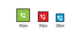
Getting your buttons the most suitable size can be quite confusing as there are various sets of guidelines that advise on varying optimal button sizes, these vary drastically from 28×28 pixels to 44×44 pixels, you can make your own judgement on what will work on your mobile website, but from my experience I would advise a minimum of 45×45 pixels (assuming you want square buttons).

See the difference that makes, this size will be large enough to allow you to accurately tap the correct, and minimising miss taps.
3. Optimise your content for ‘website scanners’
A lot of searches on mobile are done for research, people are going to want to be able to find out what they want to know quickly, they do not want to spend a lot of time reading, and nobody likes to read long documents on a tiny screen, so make your points clear and concise.
If you are giving people information about your business and what you do, bullet point the main areas you want to highlight and list them at the top of the page, and then have a more in depth description follow on afterwards. You should also highlight the key points down the page and make them stand out, so for anyone scanning will clearly be able to distinguish them.
If you are selling a product, people will be wanting to see what it looks like, how much it will cost and whether it is available to buy, so have your product pictures, price and availability be the first things they see.
4. Take advantage of people using their phones
If people are finding you on their phones, the likelihood is they will be out and about, and having a map on your mobile site could be invaluable for bringing in foot traffic, if you are a restaurant, a visitor attraction, or even a shop, it will allow people to find you based on their location.
Any phone number should be a ‘click-to-call’ button, so all anyone has to do is tap the number to start calling you.

Look at that, it is incredibly easy it is to tap the phone number to start a call, how much time and effort someone will have from trying the number in manually, this is especially useful if you convert lots of customers over the phone.
5. If there is something to fill in, keep it simple
If any of you have ever tried filling out forms or card details on a phone, you will know how frustrating it can be to input your details, so keep things as simple and basic as possible; look at Amazon.co.uk, they now have a ‘buy-with-1-click’ functionality that makes purchasing incredibly simple, with just 1 click, you instantly complete an order (I know you need to have all your details registered with them before, but imagine how much that has helped their conversion).
When you need to get someone’s address, have an address lookup, it will save a lot of hassle of trying to type it out.
When you have contact forms, make sure they are as short as possible, only have the fields that are essential, if you can keep it to 3 fields, that would be ideal (like name, email address and message), I know this will not be possible for everyone, so just remember to keep it short, and only ask for the absolutely essential details.
6. Make sure it works everywhere
As with anything you do, you need to test!
Sure the website looks great in your new Iphone 6, but what about other models? What about Android and Windows phone? You have to make sure that you test your website across multiple devices and browsers, as you do not want to alienate any particular device.

That should be the main areas you need to cover
We are not saying this will give you the perfect mobile website, but if you can follow these points, this will put you well on your way to having an effective mobile website, that will be easy to use and responsive.
If there are any additional features you need for your mobile website, or for anyone looking to get a good mobile website design, why not contact us and we can discuss through and help you with them, or alternatively call us on 01952 897 444.


