
March 15,2024
How to Choose Your Website Colours
Colours plays a crucial role in website design; in fact, they have the power to influence user emotions and behaviours in surprising ways.
The use of it can help entice customers to make a purchase, make them more receptive to your offerings, help familiarise and build trust with your brand as well as more.
This article takes a look into colour psychology and how it is used in website design to help influence user emotions and decisions.
Contents list
What is colour psychology?
Before we can understand how it impacts emotions, we should first take a look into what exactly colour psychology is.
Different colours evoke specific emotional responses and perceptions in people. This can be in both obvious ways, such as the colour yellow is associated with happiness and creativity, but also in less obvious ways, such as how it can impact the taste of food. Understanding this phenomenon is essential for web designers seeking to create captivating and impactful websites.
Did you know that colour can influence 85% of a customer’s buying decision?
Colour psychology suggests that colours can evoke specific emotional responses and associations due to cultural, biological, and personal factors. For example, red may be associated with passion, energy, or danger, while blue may evoke feelings of calmness, trust, or sadness.
However, demographics can also impact these perceptions, for example, red in China is instead associated with luck, joy and happiness as opposed to the western feeling of ‘danger’.
All of these associations, and feelings will impact a person’s decision, which is why understanding how to implement this is the next important step for any design.
How can Colour help your business?
Understanding colour psychology is important in various fields, including marketing, branding, and design. In marketing and branding, businesses use colour to evoke desired emotions and perceptions in consumers, influencing purchasing decisions and brand recognition.
In design, such as website design, or graphic design, colour choices can impact user experience, readability, and visual appeal.
Some ways that this can benefit your business include:
1. Brand Identity and Recognition:
Choosing the right colours for your brand can help establish a strong brand identity and enhance brand recognition. Consistent use of colours across your logo, website, marketing, and more can evoke specific emotions and associations, making your brand more memorable.
2. Influence Consumer Perception and Behaviour:
Colour can impact how a customer perceives your products or services and their likelihood of making a purchase.
By strategically selecting colours that align with your brand’s values and target audience, you can evoke desired emotions and encourage desired actions, such as making a purchase, signing up for a service, or engaging with your content.
3. Enhance User Experience:
Colour choice plays a crucial role in shaping your user’s experience. Thoughtfully selecting colours for background, text, buttons, and navigation elements can improve readability, and help to guide users through the website, or to take a desired action.
You can use colours to convey important information, such as highlighting calls-to-action.
4. Increase in conversions
If you want more conversions, you should heavily consider how colour might help. In fact, research shows that; merely changing the colour of a CTA button can increase a website’s conversion rates. With this in mind, colours should be carefully considered throughout your website to ensure that your clients make the desired action.
Colours and their meanings
We put together a quick list to help you learn a bit more about the different colours and their associations, and what websites they are commonly used on to help you get an idea of themes.
Red
Associations: Energy, passion, excitement, warmth, power, urgency, danger.
Where To Use: Red is used to grab attention, you will see this used in stop signs, sales banners and buttons. On a website, red is often used on Ecommerce websites to push that urgency to make a purchase, and food focused websites use red to invoke the feeling of hunger.
Blue
Associations: Calmness, trust, stability, professionalism, reliability.
Where To Use: Commonly used in corporate companies. For example you might see blue used commonly within banks, technology companies or corporate companies. This is because blue conveys a sense of professionalism, trustworthiness, and reliability.
Yellow
Associations: Happiness, warmth, energy, creativity, attention-grabbing.
Where To Use: Yellow is used in a few ways, for example in everyday life it’s used to indicate caution (e.g. caution signs, traffic lights), but generally yellow is used to create positivity (e.g. smiley faces, sun). Some websites you’ll generally see using yellow include ecommerce, retails websites to capture your attention, and children focused websites. They will use yellow to appeal to younger audiences, convey playfulness, and create a cheerful atmosphere.
Green
Associations: Nature, growth, harmony, health, freshness, stability.
Where To Use: Green is not surprisingly associated with the environment. It is often used in health and wellness industries (e.g. organic foods, acupuncture), and often used to convey a sense of peace and balance. However, green is also commonly used for Finance websites due to the feelings of stability and trust that are associated with the colour green.
Orange
Associations: Energy, enthusiasm, warmth, creativity, adventure, excitement.
Where To Use: Orange is used to create a sense of urgency and impulse (e.g., clearance sales.) You’ll often see orange used on event websites as it can create a sense of excitement, energy, and vibrancy, as well as for travel agencies, (think Easy jet).
Black
Associations: Elegance, power, sophistication, formality, mystery, strength.
Where To Use: Black is commonly used for luxury branding and high-end products (e.g. designer fashion, luxury cars),this is due to its association with professionalism and authority (e.g. business attire, formal events).
White
Associations: Purity, cleanliness, simplicity, innocence, clarity, peace.
Where To Use: White is often used in minimalist and modern designs (e.g., contemporary architecture, Apple products), and often used to convey a sense of purity and simplicity (e.g., wedding dresses, blank canvases).
Many web designers will use white to create a clean, spacious, and contemporary look.
How to use colours to influence users behaviour?
Before incorporating any colours into your website design, it’s crucial to align them with your brand. For instance, blue is commonly associated with trust and professionalism, making it a popular choice for finance-related websites seeking to instil confidence in their services. Similarly, green is often linked with health, nature, and sustainability, making it a natural fit for websites in the healthcare or green energy sectors (such as solar power…).
By first considering your brand’s personality and the emotional associations of different colours, you can effectively communicate your message and resonate with your target audience. Be mindful of industry conventions and ensure that your colour choices reflect your brand values while also appealing to your users’ preferences and expectations.
A dentist using black, or oranges or reds might not be perceived in the most conventional of ways, users may even mistake your company for something else before they’ve had a chance to look at your website.
Colour can grab attention
Vibrant and contrasting colours can be used strategically to catch the user’s eye and draw attention to important elements such as headlines, call-to-action buttons, and promotional banners.
You can use bright colours or bold accents to create visual interest and make key information stand out amidst the rest of the content.
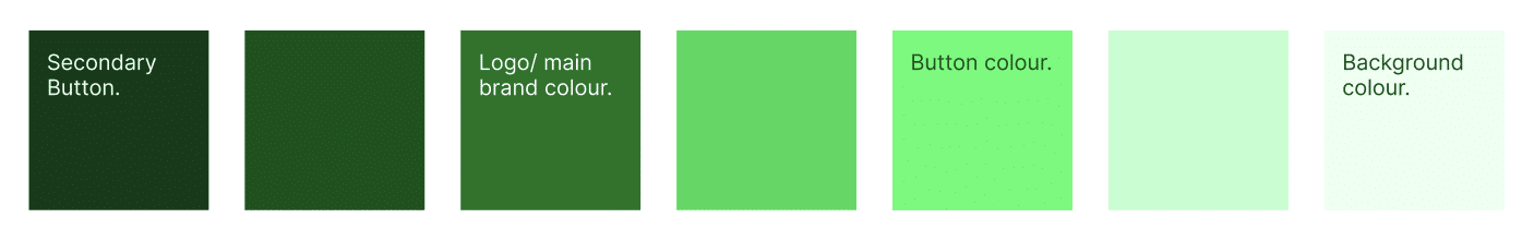
One thing to keep in mind is that pretty much all colours can become bright or dark, so if your main brand uses darker greens, that doesn’t mean you can only use dark greens. Instead, use different tones of that colour throughout the website. This way you are still incorporating your brand into your website.
Colour can hold interest
Consistent use of colour schemes throughout the website can help maintain a user’s engagement and interest. By establishing a cohesive visual hierarchy and incorporating complementary colours, you can guide users’ attention smoothly from one section to another, keeping them engaged and immersed in the content.
This will also help with association, for example, you might make your call to actions a different colour, or maybe the button within the call to action is different to the rest of your buttons, this separation will help push users to take action with that specific section, and understand that this element is separate. It’ll make your call to actions catch your users eye.
You can also use different colour accents to highlight important elements and guide the user’s focus. Make sure that you use these accent colours sparingly to draw attention to specific areas without overwhelming the overall design. This is commonly seen used in micro text, titles or links to help the user associate that element with importance, or action.
Ensure that your colours are consistent throughout and that sections are grouped. You don’t want ten different coloured CTAs, make sure that your website is consistent with your brand but visually appealing enough to hold your customers’ interest.
Encouraging action with colour.
We’ve mentioned previously that you should be using colour to encourage action, but here is how you’d actually do this.
To use colour effectively to encourage action on a website, follow these steps:
Choose your colours carefully
Select colours that are relevant to your business. And when it comes to elements that need to stand out, for example key elements such as call-to-action (CTA) buttons, links, and important information; Bright, contrasting colours like red, orange, or yellow can effectively draw the user’s eye and prompt them to take action.
But what if reds, yellows or oranges don’t align with your brand colours? Don’t worry, those are just guidelines. If these colours aren’t within your theme, simply use bolder colours that are consistent, or complimentary with your branding.
If you have a pink themed website for example, you might use a teal as a complimentary contrast to grab your users attention and build upon that differentiation between elements.
And remember, while red is a great colour for grabbing attention, if you’re, say, a health clinic red might not be the best colour to use to emphasise elements, due to the associated feelings of danger or urgency that can come with that colour. Instead, think about your colours, what colours are complementary with this and how can you use these to highlight elements through the site?
When choosing the colours for your website, the main thing to remember is that you need to make sure the decision is done carefully. Yes, you can choose colours you like, but think about how this will look for your branding, and business. A dentist using orange might not correlate properly.
Contrast
Ensure that your CTA buttons and links contrast prominently with the surrounding elements on the page. This makes them easily identifiable and encourages users to click on them. Use complementary colours or contrasting shades to make these elements visually distinct.
Use colour psychology
Leverage the emotional associations of different colours to evoke specific feelings and motivations that align with the desired action. For example, using warm colours like red or orange can create a sense of urgency and encourage immediate action, while cool colours like blue or green can convey trust and reliability.
Maintain Consistency:
Keep the colour scheme consistent across your website, particularly for elements related to action, such as buttons and links. Consistency helps users recognise and understand the purpose of these elements, building trust and confidence in interacting with them. If all of your links are different colours, users might not realise that all of these links are links. Grouping different elements throughout your website is crucial. Similar to how you might use one specific font for your titles throughout the website.
As an example, Imagine a road where each traffic light displays a different colour scheme, sometimes the stop colour is red, sometimes the stop colour is green. Now imagine trying to navigate that road, it’s safe to say you might struggle to interpret the signals and determine when to stop or go. Similarly, inconsistent link colours on a website will create confusion and hinder users’ ability to recognise clickable elements
Final thoughts
In conclusion, the use of colour in website design plays a critical role in shaping user experiences, influencing emotions, and effective communication. Colour will influence your users decisions in a range of different ways, impacting usability, navigation and comprehension to engagement and trust.
By leveraging consistent link colours, designers can guide users seamlessly through their websites and brand, ensuring clarity, coherence, and a positive overall experience.