Responsive vs Adaptive Web Design (Which is the better option)
Responsive vs Adaptive Web Design (Which is the better option)
Posted On: May 18, 2022 By Tim
So you’re thinking about getting a new website, we’re sure you’ve considered a variety of aspects such as
When getting your new website you may be faced with questions like - do you prefer responsive or adaptive design? Of course, unless you’re a designer you might not know what this is to begin with. Responsive and adaptive design will alter the way your website will appear on different screen sizes (mobile, tablet and desktop).
Of course there's a lot more to it than simply ‘changing how your website appears’ but that is the general basis, not that this helps with which one you should choose. A decision which will impact your SEO, layout, design and load times. This article looks in depth at what responsive and adaptive website design are, their pros and cons and which one is the perfect choice for you.
Responsive design
Originally, websites were created for desktops and laptops, but as we progressed further it was realised that now websites would have to adapt to a variety of other devices with different sized screens. This is where responsive design came into the picture.
Responsive design is how your website will change during the design process to different scales. In other words, if you view a website on a mobile device the layout will differ slightly, images and fonts will have been resized, but it is still one website.
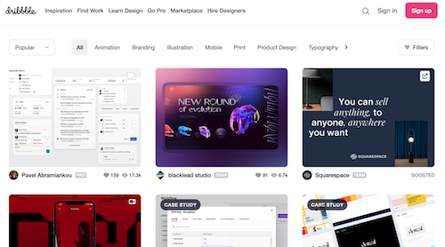
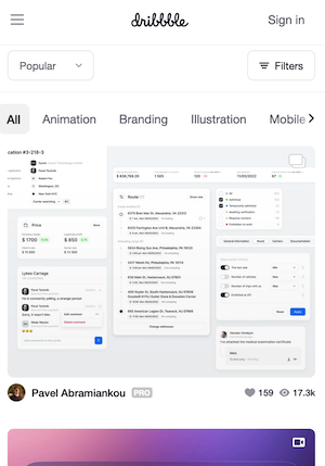
Below is an example of Responsive design, both the desktop and mobile displays.
Desktop
Mobile
As you can see, the mobile version of the website has a similar layout but all elements have been condensed, including text, imagery and navigation.
If you go on a website on your phone and have to zoom in, pan and scroll around to see the content, then that site has not been optimised for different scales and is not responsive. This is something that could lose you your customers.
If you are considering using responsive design it is important to know the pros and cons.
Pros
SEO Friendly
With Google announcing that mobile friendly websites will rank higher in their search engines, there is no better time to get a responsive website. Your website will benefit massively, as the closer you are to the top the more likely you are to bring in customers.
User experience
There are a variety of ways to improve user experience, one of which is through responsive design. Your website not only needs to attract visitors but also retain them, and with most website traffic being on mobiles having a website that works effectively on different devices is crucial.
No one will want to do business with a company that has a clumsy website, a customer will leave your site before they have to do any panning or scrolling to simply see your content. So first impressions can be everything, and a responsive website is a fantastic way of making those impressions count.
Cost effective
By having a singular website that simply adjusts to different screen sizes you will actually be saving money. One of the possible outcomes to gaining an optimised site is by purchasing a mobile version of your site, rather than having one site that adapts to different screen sizes, thus eliminating the cost for a separate version of the.
Cons
Longer load times (on mobile)
It can sometimes take the mobile versions of responsive sites a longer time to load pages, this is due to the pages having the same size files that would have been optimised for desktop and not necessarily mobile.
Older Browsers not catered for
Many older browsers struggle to run responsive designs, as they are not made to support the ever changing media queries that provide information about screen sizes. This means you might miss out on a chunk of potential customers.
Adaptive Design
Similarly to Responsive design, adaptive design will change how your website looks on a range of screen sizes. However, the main difference is that where responsive design will adjust all design elements to fit different screen sizes, adaptive design will have multiple fixed layouts and will select the best layout for different screen sizes. This means that you will have multiple versions of a website that will fit different devices.
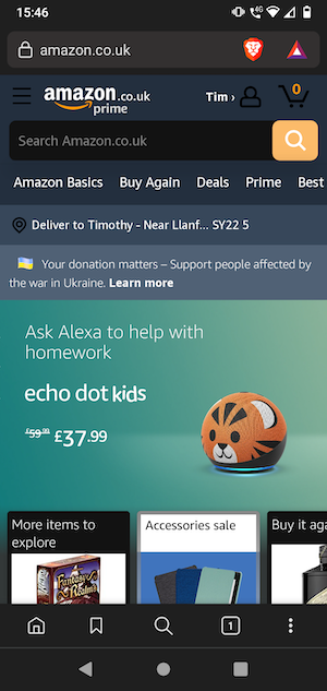
Below is an example of Adaptive design -
Desktop
Mobile
As you can see, the layouts are the same as each other, but different elements have been changed around to fit the mobile screen. If you intend to use adaptive design for your website, it is important to be aware of the pros and cons.
Pros
Faster Load times
With Adaptive design, you will have different versions of your site that will change depending on the individual screen. This means that when loading your website, the only version that will load will be the singular version that loads for that specific screen size.
Faster load times have many benefits when it comes to websites, including a positive user experience. People will be less likely to stay on your website if it takes a long time to load, reflecting negatively on your business and possibly losing customers.
User Experience
As your design will be tailored to work on different screen sizes, the website will be optimised for different devices. This will create a positive user experience as the content will be adjusted according to their screen size as opposed to a fixed mobile layout that might not fit all types of mobile devices.
As more and more people are on mobile devices, having more mobile versions of your site available creates a lot of opportunity for your business.
Cons
Time
It has been found that when designing for adaptive design, typically a variety of 6 versions are developed to adapt to different screen sizes. (320, 480, 760, 960, 1200, and 1600 pixels.)
Having to design 6 different pages can take time, even for the most experienced designers. This is before considering you will also have to maintain multiple versions of the site, which can lead to even more work on your developers.
Cost
Adaptive web design has been known to be more expensive. As there are more pages to work on, it will require more developers to design and maintain it. This means that you will have to budget accordingly, so that you can manage and support your website.
SEO difficulties
As you will have multiple versions of your site adapted to different screen sizes, you may experience issues with SEO. A study found that many search engines will rarely show multiple versions of the same content. This will make it harder for your adaptive designed website to rank higher in search results. This can have multiple drawbacks on your website's success.
How do they compare? / Which one to choose
Cost
When it comes to making your decision, one of the main areas you need to consider is your cost. Typically larger businesses will opt for an adaptive website, and smaller businesses will choose the latter. This is due to the amount of work that goes into one in comparison to the other. You will likely need multiple designers to work on adaptive designs. As you will probably have around 6 variations of your website for different screen sizes, you may need multiple designers and developers to make it look good and work. The cost efficiency of responsive design might be the reason it is usually the choice for smaller to medium sized businesses. This and the fact that responsive designs require less ongoing maintenance.
User experience and Design
Adaptive design is a great method, and it has been argued that overall for user experience adaptive design is the better choice. As you have multiple versions of your website, more screen sizes will be considered and therefore more people are catered for. That’s not to say that having a responsive design will create a bad user experience. On the contrary, responsive designs are made for desktop and mobiles, but also tablets, an area which can often be overlooked with adaptive designs.
Responsive design uses CSS to resize, shrink, move content and more to look good on different screens. This can often mean that your site will take time to design, as you would need to make it look good and cohesive on desktop, mobile and tablet. Regardless of this, adaptive design will still take longer due to the amount of work needed to be put in, before, during and after the website is complete.
SEO Benefits
When considering SEO, a responsive design will take the cake. With Responsive design there is only one version of your website, this has an impact on things like crawling. Your site will only have to be crawled once. On the other hand, due to the (in this example) six versions of your website, crawling will be done multiple times. As has been mentioned previously, google is unlikely to rank content that is the same. This is what makes responsive designs better when it comes to SEO.
That's not to say that having an adaptive site will result in bad SEO. The opposite can be said. Adaptive websites typically have faster loading times, because all of the content is catered to each screen size as opposed to resizing and changing elements throughout your site. Faster load times will have a great impact on your customers, and can make or break your site. However, in the grand scheme of SEO, owning an adaptive site can become labour intensive and time consuming.
So which one should you choose?
You will need to consider your budget, business size, and how the different pros and cons might play a part in your site's success, but ultimately the decision is yours! We also recommend you take a look around at a few adaptive and responsive websites, look at both desktop and mobile versions to get a feel for how they work and look.


 Building Your Ecommerce Sales
 Open & Transparent Communication
 Dedicated In-house Support Team