Could Having a Mobile Website Affect Your Ranking?

Could Having a Mobile Website Affect Your Ranking?

Posted On: Dec 08, 2014 By

mobile-ranking 
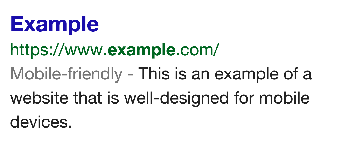
Google recently announced that they would be steadily rolling out a visual cue to mobile users to help them out a little more when they’re searching on the go to see mobile friendly websites. [caption id="" align="aligncenter" width="588"]Example of Google's updated mobile search engine results New cue on Google for mobile draws attention to mobile-ready sites[/caption] This is great news for us as users. I’m sure like me, you’ve been to Google on your smartphone whilst out and about and tapped a link that takes you to a desktop-size website, fully zoomed out, tiny text, awkward buttons and even missing content. It’s not a great experience for sure, especially when you have to start doing two-finger touch gestures with one hand… something’s going to go - probably the phone. Obviously, it’s taking a little bit of time for every website to come around to this “mobile thing.” Realistically, it’s not going to happen where every single website in existence will be mobile-friendly. But with Google’s little announcement, we could all be getting a swift kick up the backside! Tucked away towards the end of their announcement is this little gem:
“We are also experimenting with using the mobile-friendly criteria as a ranking signal.” – Ryoichi Imaizumi and Doantam Phan, Google Mobile Search
Stop press! That’s right, Google are doing a little experimentation with their fortune-altering ranking algorithm. This means we probably won’t get much detail, if any, on exactly how this affects your ranking over their testing period, when that period will start and end, and what lasting impact that may have on rankings. It’s never safe to assume with Google, but this change is probably only likely to affect your site’s ranking for people using Google on their mobile device. It may not impact it at all in certain circumstances and the only real way to tell is if you’re keeping an eagle-eye on your mobile traffic stats. But couple this with recent evidence suggesting that following responsive web design principles could actually beat having a separate mobile website (aka ‘m-dot’ sites) and that even apps can’t trump mobile sites when it comes to retail sales, it seems a responsive version of your existing website is the better way to go - especially if you factor in the possibility that having two separate sites could mean competing with yourself in the SERPs (Search Engine Results Pages). The upshot of this is - and I can’t overstate this - your website needs to be mobile-ready. The fact that Google are even thinking about this sort of visitor-focussed ‘enhancement’ to their results pages shows how serious it is to them. And undoubtedly they’ve got scores of data, showing exactly how visitors react on their tablets and smartphones when they visit a desktop-only site. So if you want to stay on top of those rankings in all contexts and, more importantly, be as useful as possible to your potential and existing customers - whether they’re at their desks or on the move - your website absolutely must be ready for mobile. Need some help? We can make sure your website is mobile-ready and Google-friendly, contact us today!
Ready To Talk

Choose a better website

Give us a call on 01952 897444. Alternitavely, drop us a message.

Drop us a message →